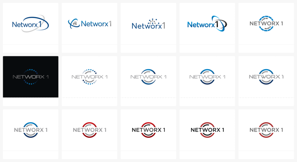
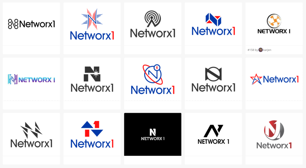
Networx1 had an existing logo but it was only a starting point. See the journey we went on with our revisions and these are only a portion of the 300+ revisions.
Final Logo Design:
Networx1 had an existing logo but it was only a starting point. See the journey we went on with our revisions and these are only a portion of the 300+ revisions.
Final Logo Design:
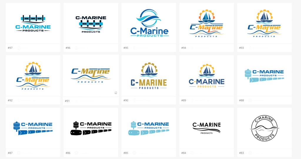
Mike had his original logo since 1983 and although we have an appreciation for history and heritage, it needs a refresh. We did an immediate font logo then got to work on the almost 200 logo variations to present to him. As you can see below, some of them were very different.
URL: https://cmarineproducts.com
1983 Logo:
Examples of some of the 200 logo variations:
Final Logo:
As all of our logo projects do, this logo started off with a company name and some ideas. 250+ versions later they had the EXACT logo they had been dreaming of. It doesn’t always take so many logos to nail down a project but when you’re looking for something VERY specific, it takes time.
URL: https://thefastingprotocol.com
Final Logo:
When your client gives you a hand draw “idea” of what they want, you cry. Why? You cray because it’s SOMETHING to go off of! There are so many times our clients can barely describe what they want. We still succeed in giving them what they want, it’s just a little more challenging. Not here, after we had a starting place, we created them exactly what they wanted.
Sometimes it takes a few logos to create the exact logo they didn’t know they were imagining! In this case, over 200 different (generally just slightly) to find the exact one they wanted. Now? They’re happy and have a thriving business.
Sometimes the tried and true ideas are the ones that just work.